The state of Kansas requested a public-facing strategy to quickly and effectively roll out the COVID-19 vaccine.
DESIGN CONCEPTS
The case team wanted the design to “look good, but not too good.” So we needed to be strategic in creating strong designs that were not too complex.
We strategically used the campaign messaging to do a lot of the heavy lifting. We knew we would need to keep the designs relatively simple and saw potential to build the concepts around different tones that resonate with Kansans.
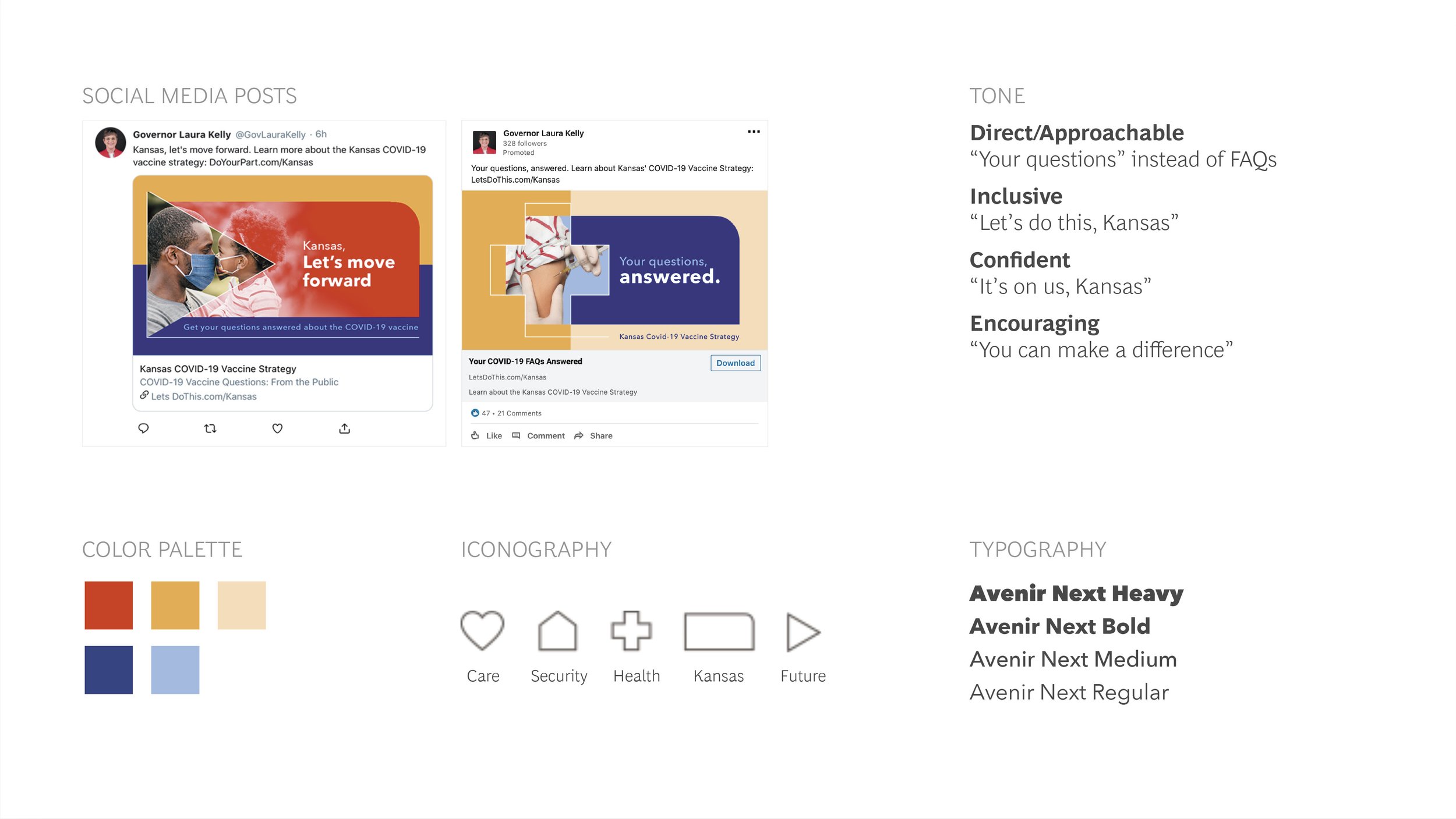
Concept One | Kansas, let’s do this
This design builds upon the “It’s up to us, Kansas” campaign. The color palette is a softer take on red, white, and blue—making the design feel warm and approachable. The iconography represents the things that matter most: health, security, relationships, and progress. These icons frame imagery of Kansans overcoming the challenges of COVID-19 in their everyday lives.


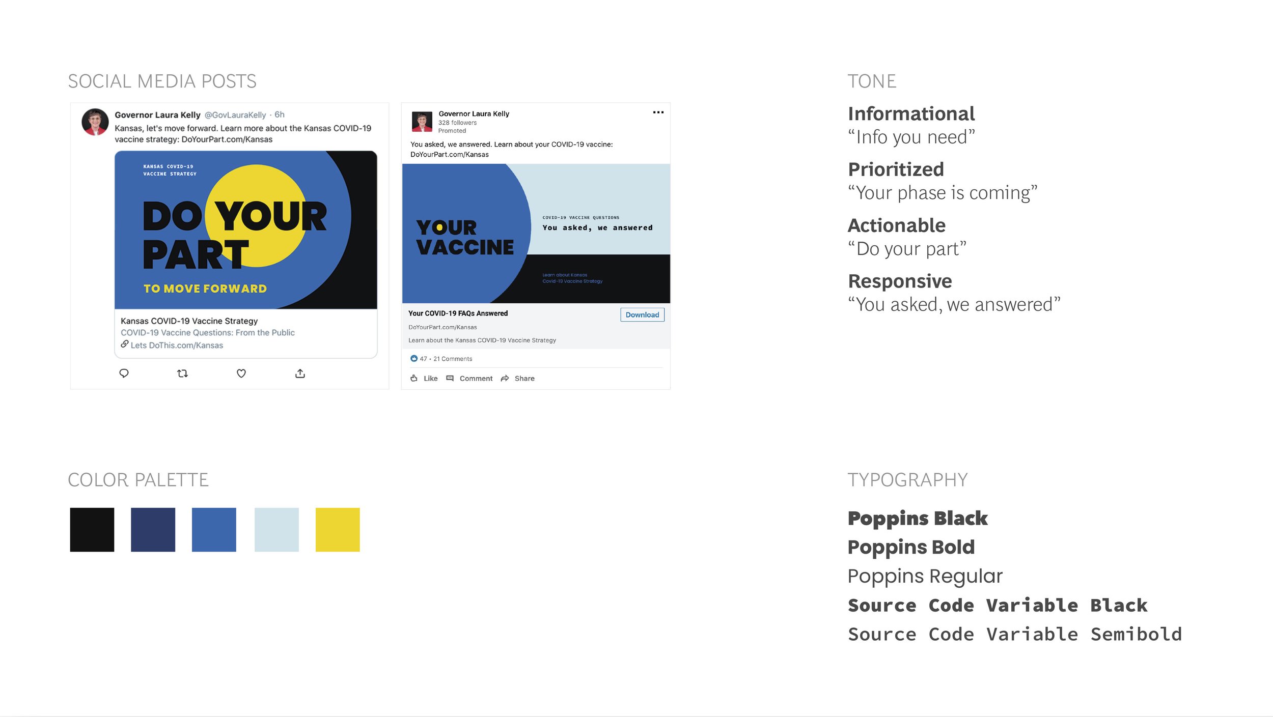
Concept 2 | Do your part
This design speaks to individuals and communicates each person’s centrality to the Kansas Covid-19 Strategy. The bright yellow circle within the word“you” is used to highlight each individual’s importance and prioritization within the strategy. The messaging and visuals are direct, creating clarity around information and benefits of the Covid-19 Vaccine.


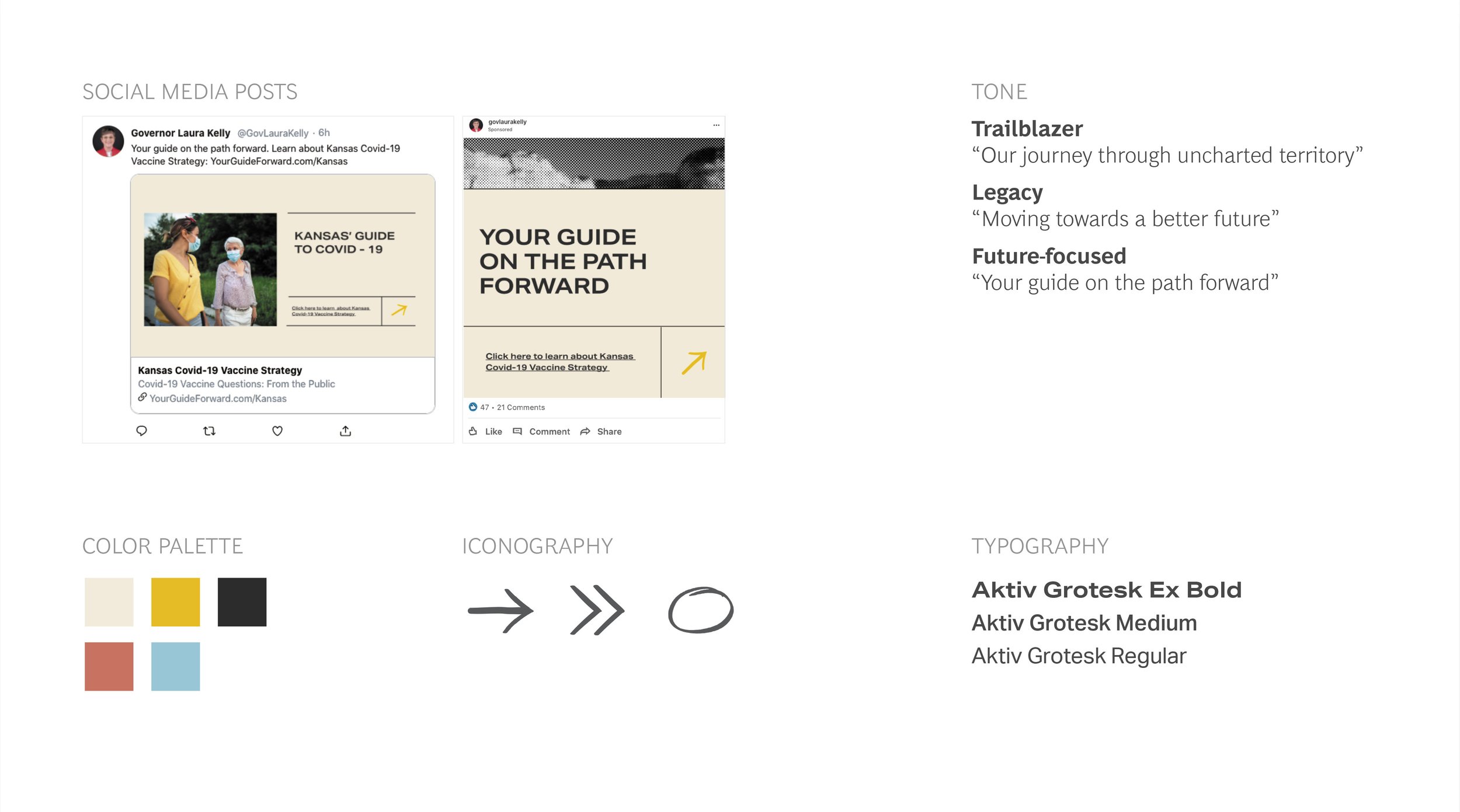
Concept Three | Your guide on the path forward
Together, we will carve a path through history. Kansas’ Covid-19 response acts as a dependable field guide for its citizens—a constant in turbulent times. Modern imagery is paired with nostalgic landscapes that have evolved throughout history. This juxtaposition is tied together by hand-drawn elements that highlight important details. The guide calls upon Kansans to be the trailblazers, understanding the need for the Covid-19 vaccine and working together to build a better future.